Release Notes
New Features
Usability Improvements
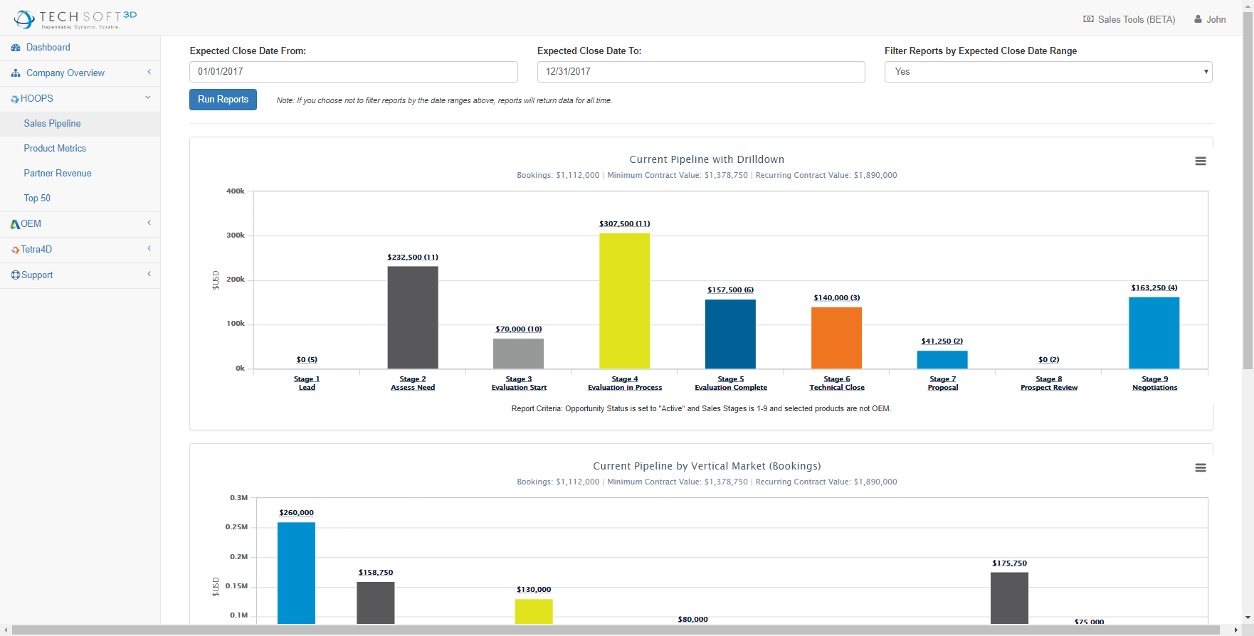
Over the last six months we've recieved requests for new reports and realized that the menu structure and UI of the reporting dashboard wasn't as intuitive and easy to use as it could be. In the old UI we gathered reports based on product type and didn't give us the flexibility we needed to publish reports for departments that aren't tied to a specific product. Additionally, we're rolling out some new reporting structures that need to be easily replicated within the dashboard; KPIs and team goals should reflect support of our larger initiatives which was something difficult to reflect in the old UI.
Old UI
New UI
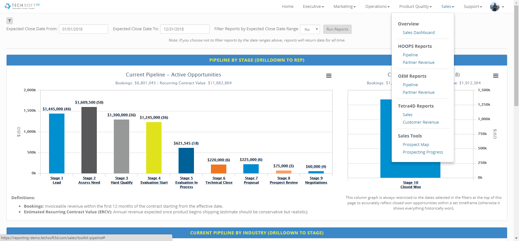
The new UI sorts reports by department to quickly find information by team as opposed to buried information by product. We've moved from a left-pane menu to a top menu and have collapsed filters to give more screen space when viewing reports on smaller devices. To help with visibility, we've added report headers to each widget so that you can find reports faster with less strain on your eyes while searching.
Company and Team Dashboards
We're introducing a new way of viewing department goals and KPI measurements that connects the corporate goals and OKRs to each department. You can easily upload and display manually generated reports using the Department Dashboard section. File types supported in the view port are PDFs, however you can upload other file types which will be downloaded when the user selects that report from the navigation on the left.
User Profile (OneLogin)
To make the dashboard feel more social, we've integrated user profiles with OneLogin so that we're now able to pull your information directly to the reporting dashboard. Make sure to update your user profile picture.
Release Notes
Knowing what's changed is important, so we've added release notes (which you're reading right now). We'll do our best to list all of the changes we're making, especially if reports are being added, changed or removed. We want to make sure that you're not confused during new changes; be sure to check the new releases page every once in a while. Major releases will be communicated via email, however minor releases usually happen pretty quickly to keep things relevant. Having release notes will help employees keep up with the change of pace of the dashboard.
Report Updates
Support Reports
- The QA reports for bugs, egregious errors, and regressions are now backed by live data pulled from Eventum and Jira.
New Features
Prospect and Customer Map
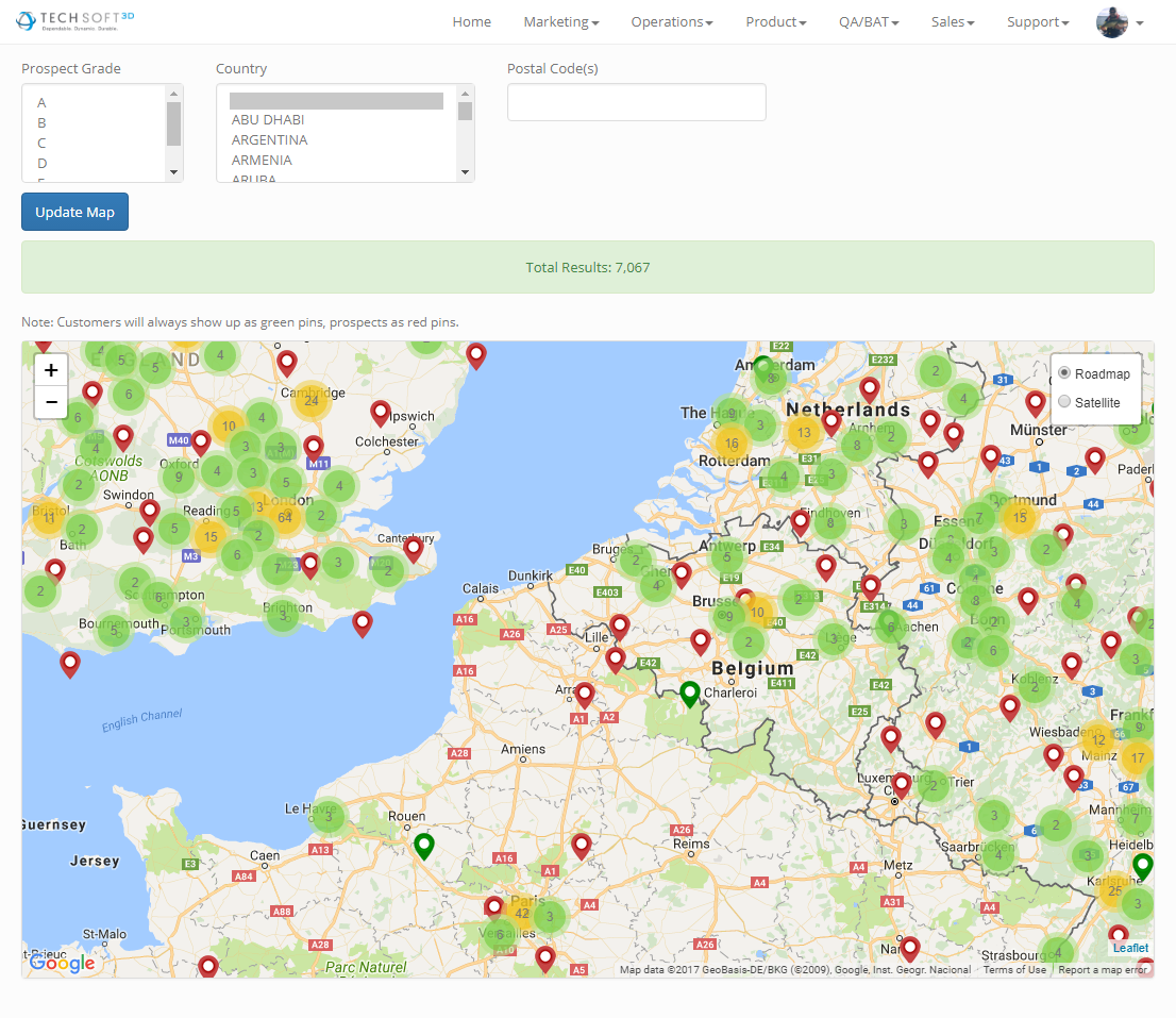
One of the best ways to get in contact with prospects is to visit them, but identifying groups of prospects can be difficult. In the past, reps have exported lists of the prospects in the surrounding areas they plan to travel to and upload those lists to Google Maps to take with them. We felt that process should be easier and automated - so we did it. We've created a custom map solution that uses address information from SugarCRM that is geocoded regularly to build a comprehensive prospect map. The prospect map allows reps to view prospects worldwide and gives them quick access to account information in SugarCRM, LinkedIn profile searches and gives a great visual of the proximity of existing customers/prospects are to one another. Some of the features include:
- Sort by Prospect Grade, Country, or Zip/Postal Code
- Re-renders new prospects/customers with movement
- Icons provide easy navigation to SugarCRM records and LinkedIn profiles
- Works on Mobile if you're on the go!
- Data is pulled from SugarCRM Addresses - Make sure they're up to date!
- Easy to find customers that are near prospects
Report Updates
Support Reports
- Added new support reps to be included in all reports.
- Modified how the reports are queried (Tino) so that "handled" issues are more accurately reflected.
- Revised the way that handled cases are pulling to include missing support reps (Rie and Simon)
Operations Reports
- Added a Partner Top 50 report for total partner revenue based on the last rolling twelve months of billing.
Sales Reports
- Current Pipeline by Industry
- Modified grouped industries into individual industries.
- Assigned industries to opportunities with no industry listed.
Performance Improvements
- Removed misc unused endpoints
- Refined data pulled from NetSuite to reduce the number of web queries used for each report.
New Features
Corporate OKRs and Annual Goals
We've added a section that will allow employees to view OKR progress based on regular updates from OKR owners. As activities and OKR tasks are developed and completed, we will keep a running track record of updates and task status' to give an overview of the OKR as it proresses. At any time, an OKR owner may change depending on the need of that OKR, you can see a "version history" of sorts if you click on the "More Detail" section of any OKR widget.
Prospecting Progress
You can now track the number of new contacts, companies and opportunites that are created in SugarCRM. This leaderboard is used to quickly identify the partner development reps that are leading the charge in prospecting.
Tetra4D Sales and Marketing Section
We've added some information for Sales and Marketing of the Tetra4D products. You can now view Sales reports by product and by Value Added Reseller on a year over year basis by quarter. Marketing reports include the number of new leads generated by our marketing campaigns and campaign performance over time.
Report Updates
Sales Reports
- Current Pipeline by Stage
- Modified the criteria of this report so that "Stalled - Business" and "Stalled - Technical" are no longer included in results.
- Added search filters to enable the user to limit the pipeline to specific dates.
- OEM Pipeline
- revised the OEM Sales Pipeline Stages within SugarCRM to more accurately reflect deal stages.
- modified the criteria to use OEM Opportunity Type field instead of HOOPS Opportunity Type field.
- removed RealDWG opportunities from the pipeline
Product Reports
- Evaluations by Product
- Modified the revenue calculation for Web and Desktop Platform opportunities. Since we don't allocate Estimated Recurring Contract Values (ERCV) on a per product basis, Web Platform opportunities are now calculated as (ERCV/4) and Desktop Platform opportunities are calculated as (ERCV/3) to reflect a "standard" allocation.
Removed Reports
Operations Reports
- DLA Closed This Year and DLA Closed This Year with Projections were removed because the closing of DLAs within SugarCRM lags significantly behind other more current (non-reportable) information coming from Reps.
Product Reports
- Removed Release Calendar from the Product Dashboard
Performance Improvements
- We've modified the way that we're pulling data from SugarCRM. Originally, we used their REST api to retrieve data but have recently identified bugs that cause data to be incomplete. We're now pulling directly from the SugarCRM MySQL database which enables more accurate data and improved performance for all queries.
- Removed Client Side AJAX requests for report data to server side rendering. This adds additional security by removing client side endpoints from the application to prevent DoS attacks of those endpoints.
- Added SAML 2.0 Authentication from OneLogin and removed Local Authentication methods for added security. Users are automatically provisioned access to the dashboard once they are setup in OneLogin; less passwords, less hassle.
One of the major 2016 initiatives in business systems was to increase visibility of the data in the various applications we use to create a dashboard where key metrics are clearly visible and easily shared in a single place. This was a huge undertaking; our initial prototype was up and running in a couple months however we quickly realized that the underlying data needed a lot of work. The last 12 months has included a lot of data cleanup from each department throughout the company and we're pretty excited about what we've come up with for v1. All of the dashboards listed below are ran real-time; you click the button - you get results from that exact moment.
Sales (HOOPS/OEM)
The sales dashboard is intended to give a brief overview of the pipeline and closed deals from SugarCRM. There are separate dashboards for OEM, HOOPS, and Tetra. Below are the reports that have been included in this release with a brief description of the logic behind each report.
- Current Pipeline by Sales Stage
- Current Pipeline by Industry
- Current Lost Opportunities by Reason
- Current Closed Won Opportunities by Type (New vs. Existing)
Operations
The operations dashboard gives a brief overview of reports that indicate the status of our revenue and a quick glance at the status of DLAs within a given year. This will be the place where you'll find a majority of the closed revenue reports (i.e., money in the bank, not pipeline).
- Revenue, Operating Expense, NOI
- DLA Closed This Year
- DLA Closed This Year w/ Projections
Product
Here you'll find a unique view of the current pipeline, total product downloads and a brief overview of the bugs we're fixing. Gavin really wanted to have a view of the pipeline by product so that when we're working issues and bugs related to our products we know the implications of our actions - we want to work on the bugs that help us close deals.
- Open Evaluations by Product
- Total Product Downloads
- Bugs Overview
- Total [Billed] Revenue by Product
- Release Schedule/Calendar
Support
The support dashboard encompasses support engineering efforts and an overview of issues by customer for a given period. The Issues Overview section will highlight customer issues over time and product related issues that the support team is addressing. Productivity is a focus on the performance of support engineers and their efforts to handle customer issues.
- Issues Overview
- Issues Overview
- Customer Issues Overview
- New Issues Created Per Product by Month
- New Issues Created Per Product By Year
- Productivity
- Total Open issues
- Total Handled issues
- Total Avg. Interactions
- Total Avg. Initial Response
- Average Interactions by Support Engineer
- Average Initial Response Time by Support Engineer
- Issues Handled by Engineer